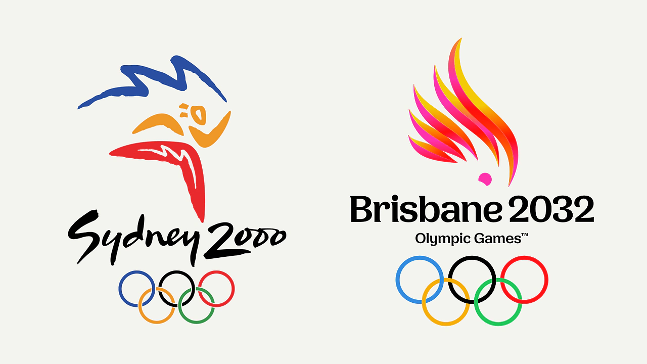
Australia has hosted three Olympic Games: Melbourne in 1956, Sydney in 2000, and now Brisbane is preparing for 2032. While it's tempting to compare all three visual identities, I don't think that's particularly fair to Melbourne. Graphic design, technology and the expectations surrounding major sporting events have changed enormously since the 1950s.
Sydney 2000, however, is a different story. It's a much more relevant comparison, and one that makes Brisbane's newly unveiled identity feel particularly disappointing.
I've worked in graphic design for a long time, and when I first saw the Brisbane 2032 emblem, I genuinely thought it looked like something someone had put together in Canva over an afternoon. It feels incredibly underwhelming for an event of this significance. I actually struggle to think of another major sporting identity in recent years that's left me feeling quite so disappointed.
Perhaps I'm being overly critical, but the more I look at it, the more I question the creative decisions behind it.
Sydney 2000: A Masterclass in Graphic Design
I still consider the Sydney 2000 Olympic identity one of the finest examples of Australian graphic design.
The original Sydney Olympic bid identity was developed by Michael Bryce, while the final Millennium Man emblem and broader visual identity were created by FHA Image Design. Looking at the work today, you can see just how carefully considered the entire system was.
Everything seems to work together. Contrast, variety, rhythm, harmony, unity, scale and proportion. The athlete has an incredible sense of movement, and the composition feels energetic without becoming complicated. The integration of the boomerang forms, Olympic flame and Sydney Opera House creates something distinctly Australian without relying on the usual visual clichés.
Even the typography is fantastic. There's a handmade quality to the lettering that feels authentic, relaxed and distinctly Australian, yet still modern. It doesn't feel like an existing typeface that someone has downloaded and modified. It feels like it was developed specifically for the identity, and it complements the movement of the emblem beautifully.
Then there's the colour palette, which I think is extraordinary. The confidence required to combine bright blues, yellows, oranges, purples and reds into one cohesive identity is something I genuinely admire. Some of those combinations would probably raise eyebrows in a contemporary brand presentation, yet Sydney managed to make them work on one of the biggest stages imaginable.
What makes it particularly impressive is how the identity translated across practically everything. From the sporting pictograms and posters to the uniforms, flags, signage and merchandise, the entire system felt connected. Every sport, from archery to wrestling, had its own visual requirements, yet the branding remained recognisable and consistent.
I particularly remember the bright blue volunteer uniforms, the colourful polo shirts, the flags and how vibrant Sydney looked during the Games. The whole city seemed to come alive with colour. It wasn't simply a good logo placed on different things; it was an entire visual language that created an atmosphere.
To me, that's what makes it such a masterpiece. You can see the thought that went into both the individual elements and how they would work together.
Brisbane 2032: Where's the Energy?
Jump forward to Brisbane 2032, and we're presented with an identity that feels almost entirely devoid of those qualities.
The centrepiece is a cockatoo, with a pink cockatoo representing the Olympics and a sulphur-crested cockatoo representing the Paralympics. The organisers have explained that the designs incorporate references to Queensland's geography, the Olympic and Paralympic flames, and even the number 2032.
I understand the thinking behind choosing a recognisable Australian bird. Cockatoos are cheeky, playful and full of character, and those qualities certainly have a connection to Australia's personality.
But what does that have to do with the Olympic Games?
When I think about the Olympics, I think about determination, performance, achievement, competition and extraordinary human capability. I think about movement, strength and athletes pushing themselves beyond what most people would consider possible.
I don't see much of that reflected in this design.
The cockatoo feels more appropriate for a tourism campaign than the world's largest sporting event. It's friendly and approachable, but I don't find it particularly inspiring.
The symbolism is clearly intentional, and I'm sure an enormous amount of research and consideration went into the project. But from a visual communication perspective, I question whether the final result successfully conveys the qualities I'd expect from an Olympic identity.
If I were choosing an Australian bird to represent Brisbane, I'd probably be more inclined to explore rainbow lorikeets or other native parrots. Their natural colouring already incorporates many of the Olympic colours, offering an opportunity to develop a broader, more energetic visual palette.
Lorikeets feel youthful, playful and free-spirited. There's a sense of movement and personality about them that could translate beautifully into an Olympic identity. Choosing a different bird wouldn't automatically make a better design, but exploring the colour, movement and character of these birds could have been an interesting starting point for the broader visual system.
Interestingly, Brisbane 2032's Chief Marketing Officer, Brent Hill, previously led Tourism Fiji and served as CMO of the South Australian Tourism Commission. His appointment placed a strong emphasis on promoting Brisbane and Queensland internationally. That doesn't necessarily explain the creative decisions, but it does make me wonder whether the identity has leaned too heavily towards destination marketing at the expense of sporting expression. The cockatoo, friendly typography and emphasis on local character feel more like an invitation to visit Queensland than a celebration of Olympic competition.
The Typography
The Brisbane 2032 typography is another element I find particularly disappointing.
Although it's apparently a custom typeface, it looks remarkably similar to something you might download from Creative Market. The letterforms feel soft, rounded and almost floppy. There's very little tension or movement, and nothing that immediately communicates sport or performance.
I could imagine something similar working beautifully for a coastal café, a lifestyle brand or even a nursery. But an Olympic Games?
Compare that with Sydney's lettering. It was informal and approachable, but it still had a genuine sense of momentum. It complemented the athletic figure rather than simply sitting underneath it.
Brisbane's typography seems to prioritise friendliness over almost everything else. There's nothing inherently wrong with that approach, but I struggle to understand why it's the direction chosen for an event that celebrates athletic performance at the highest level.
Two Cockatoos, One Identity
I'm also unconvinced by the decision to create two slightly different versions of the emblem.
I understand the Olympics and Paralympics are separate events, and the organisers have chosen different species of cockatoo to represent each. But from a visual communication perspective, I question what this distinction actually achieves.
Both versions share essentially the same underlying concept and composition, with variations in colour and the bird's crest. Unless someone takes the time to examine them closely, I doubt most people will immediately recognise the difference.
It feels like another layer of explanation required to justify the design rather than something that contributes meaningfully to its effectiveness.
What About the Colours?
One of the things I remember most vividly about Sydney 2000 was just how colourful everything was.
The bright blue volunteer uniforms, the polo shirts, flags, stadium signage and extraordinary combinations of oranges, yellows, purples and reds. The entire city seemed to come alive with colour.
It wasn't simply a colourful logo. It was an entire visual identity that translated beautifully across almost every application imaginable.
Brisbane, at least from what we've seen so far, seems to be taking a much more restricted approach.
With the pink and yellow cockatoos dominating the identity, I'm struggling to imagine how these colours will develop into a broader visual system with the same energy and versatility.
A limited colour palette isn't inherently a bad thing. Some of the world's most recognisable brands use remarkably few colours. But the Olympic Games are an entirely different proposition, requiring an identity that can stretch across dozens of sports, enormous venues, uniforms, broadcasting and countless other applications.
My concern is that Brisbane has established such a narrow visual direction that expanding it might prove difficult without losing consistency.
Alternatively, the designers may introduce an extensive supporting palette and graphic system that we simply haven't seen yet.
And that's where I think it's important to be fair.
We haven't seen enough of Brisbane's complete identity to judge how effectively it will work across all these applications. Sydney's success is something we can evaluate retrospectively, while Brisbane is still developing.
I'm not convinced by what I've seen so far, but I'm prepared to reserve judgement on the broader identity until we see how it's actually used.
Conclusion: Perhaps I'm Biased
I'll admit that I might be slightly biased towards Sydney 2000.
I was 20 when Sydney hosted the Olympics, and I remember just how extraordinary the entire experience was. The colour, excitement and atmosphere throughout the city left a lasting impression, and I'm sure that influences how I look back at the identity today.
But even allowing for that nostalgia, I still think the Sydney 2000 branding stands up as an exceptional piece of graphic design.
What I admire most isn't simply the logo itself. It's the level of consideration that went into the entire visual system. Every element seemed to have a purpose, from the smallest sporting pictogram through to the enormous environmental graphics.
Everything worked together while maintaining its own character.
Looking at Brisbane 2032, I don't get that same feeling.
The emblem feels underwhelming, the typography lacks energy, and the overall concept seems better suited to a tourism campaign than an international sporting event.
Perhaps the broader identity will change my opinion. We still have six years before the Games, and there's an enormous amount of creative work yet to be revealed.
I genuinely hope the designers prove me wrong.
But when I look at Sydney 2000 and Brisbane 2032 side by side, I can't help feeling that we've gone from an identity that celebrates the extraordinary capabilities of athletes to one that celebrates a cheeky Australian bird.
And for an Olympic Games, I think that's a disappointing starting point.